I have decided to do some logo research today. First of all im going to research the nintendo logo. Even though nintendo is the most popular leading games company brand in the world, they prefer to stick to a simple logo which has been around since 23rd September 1889. Ever since then all they have done to their logo over the years is only change its basic colour and odd occasions, the background. It has varied from Silver to Red. Red is their current colour and here is an image of their logo.
The next logo I am going to research is the Capcom logo. The company had this logo in 1989 January. It's a simple yet easy and the colours lock into your mind. This colour scheme of Blue and Yellow have been used in many logos but I think Capcom do it best. Here is an image of their current logio.
Wednesday, 15 December 2010
Animation Logo
Now I have made my logo and animated it in black and white, I thought I would make it flash only, here is what I have done.
I think I could have done much better but due to the limited time I had left to do this logo I would have done much more, maybe swing the sword around or something. Oh well whats done is done. I will do something like that later on into the project.
I think I could have done much better but due to the limited time I had left to do this logo I would have done much more, maybe swing the sword around or something. Oh well whats done is done. I will do something like that later on into the project.
Tuesday, 7 December 2010
Buttons
We have been animating buttons through flash, I have managed to make the animation freeze between frames by clicking the buttons, here is a screen shot of what I have done.
Next we have added text to one of the buttons and played it while adding a scroll bar, here is the next screen shot.
Next we have added text to one of the buttons and played it while adding a scroll bar, here is the next screen shot.
Wednesday, 1 December 2010
Photoshop video
Here is my first attempt of doing video on photoshop, i have used screenshots from a anime called Bleach. Here is my finished version.
Tuesday, 30 November 2010
Website Logo
Today we have been researching logos and I have designed one for a website called Tenembra Wasteland. Here is my logo created for the website.
Web research
Here is a website I have found by going on the 99 Designs page. I think this website has good colours, good quality images and very well laid out. Also the logo is well placed and the links are relatively easy to spot and click. The sides that are like a bit of a wooden design go well with the theme of the web page too. Here is the screen shot.
Tuesday, 9 November 2010
Photo Merge
Now we have lent a camera and went on top of the College building. We took about six or seven different pictures and uploaded them onto the computer. We then opened up photoshop and used Photo Merge. Here is my finished result.
Weird apple thing
Next we have had to make a square like apple and turning it into a cut open apple, we used liquefying and special paste with painting on a frame to make the apple square. We used the Shift and clicking to draw straight lines. Here is my apple.
Snooker Ball
Today we have been doing demo's. First we have to make our own snooker balls without following a demo. This is what my version came out like.
Next we did the same but with a demo to help us. We used a lot of shading, the Elliptical Marquee tool with the shapes and the lighting. We also shrunk the opacity down to make the shading easier. Here is my finished version.
Next we did the same but with a demo to help us. We used a lot of shading, the Elliptical Marquee tool with the shapes and the lighting. We also shrunk the opacity down to make the shading easier. Here is my finished version.
Monday, 8 November 2010
Tween
Today we have been learning how to tween with frames. We have took two images from the internet under the High Street search in Google Images. We have then used multiple frames using the F6 button to clone the frames over and animate it by editing the last frame, the first time I zoomed in and and left the image in its zoomed in state. Next I added another image and made it scroll across the screen. We have used the Classic Tween to help us out in this mini clip. Here is a video of the finished version.
Wednesday, 20 October 2010
Shop design
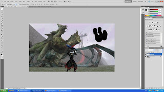
Today we have designed a front for a shop, I have decided to use dragons again as i have based m ost of my work around dragons, i have used a few masks, shapes and word techniques and this is the finished outcome, the dragon is known as a Rathalos from a game called Monster Hunter, well here it is (:.
Tuesday, 19 October 2010
More 3ds max
Next we have experimented more with extruding and polygonal features on 3ds max. This is what my finished result of a normal block warped in many ways by my weird mind (:
3ds max
Today we have been experimenting with a new program called 3ds max. We have been practising making many shapes and altering the size, rotating and scaling the shapes. We have also been using word text in the 3ds max and making them 3d with changing fonts and colours. This is what our final results of the text turns out after putting it in the background in a photoshop program.


Monday, 18 October 2010
Marantz
Today we have learnt how to set up the marantz, we had to use both the internal microphone and the external microphone. We also had to set up with the various leads and cables to connect the microphones up. We also used headphones to listen to what we have made through the microphones.
Monday, 11 October 2010
Graffiti
We watched a video about graffiti art today. About how this french guy named Thierry Guetta manages to go around many cities in the world filming many people gifted in graffiting the streets. After he had done so much filming and promised them all a documentary he was only doing it to serve his own needs. After filming the street artist Banksy who he has been looking for a long time, he managed to confront Thierry to make the documentary. After all the risks we have watched them do like climbing buildings and managing to get away with everything from the police, we have seen what more graffiting is about.
Monday, 4 October 2010
Animation Research
We created a flash image for flash animation by using the rulers in photoshop and then following Ctrl+a and Ctrl+c. We then paste the image into the Iphone option of flash. We also learned how to create more frames in flash by pressing the F6 button. We practised using the shape button for ovals and also used the pen tool to make and create wavy lines. We have also used the F8 button to turn a circle into a symbol and managed to make it into a seperate layer. We then added many frames and moved the circle several times. We used the F6 button to copy the clip and moved the circle at the end. After pressing play (Enter button) we get to view what we have created. This is what we know so far. More to come soon.
Subscribe to:
Comments (Atom)


